Full API
- betterplotlib.subplots(*args, **kwargs)[source]
A wrapper to the plt.subplots() function, and is the main way to access the betterplotlib functionality.
This is exactly the same as the plt.subplots() function, only that it creates betterplotlib axes objects rather than matplotlib ones. The betterplotlib objects are where all the magic happens.
- betterplotlib.set_style(style='default', font='Lato', fontweight='semibold')[source]
Set style settings that will apply to all plots after this function call.
- Parameters:
style (str) – I have three predefined styles: “default”, “white””, and “latex”. On the whole, they’re all pretty similar. The default style is appropriate for presentations and paper figures. “white” takes the default style and turns the axes white, so that it can be used in a presentation with a dark slide background. When using the “white” style, you’ll probably want to save the figure with the “transparent=True” keyword so that the slide background shows through. Finally, the “latex” style uses LaTeX to render all text. Note that all styles can fully render LaTeX equations in axis labels and other text, but the “latex”theme uses the Computer Modern LaTeX font.
font (str) – For the default and white styles, the font to use. Must be the name of a font available through Google fonts. The font will be automatically downloaded if not currently present on your system.
fontweight (str) – The weight of the font
- Returns:
None
import betterplotlib as bpl
bpl.set_style() # default

fig, ax = bpl.subplots()
for i in range(3):
    ax.scatter(np.random.normal(i, 1, 100), np.random.normal(i, 1, 100))
ax.add_labels("X Label", "Y Label", "Title")
import betterplotlib as bpl
bpl.set_style(font="DejaVu Sans")

fig, ax = bpl.subplots()
for i in range(3):
    ax.scatter(np.random.normal(i, 1, 100), np.random.normal(i, 1, 100))
ax.add_labels("X Label", "Y Label", "Title")
import betterplotlib as bpl
bpl.set_style("white")

fig, ax = bpl.subplots()
for i in range(3):
    ax.scatter(np.random.normal(i, 1, 100), np.random.normal(i, 1, 100))
ax.add_labels("X Label", "Y Label", "Title")
If you download this previous image you can see that the background is transparent and the axes are white.
import betterplotlib as bpl
bpl.set_style("latex")

fig, ax = bpl.subplots()
for i in range(3):
    ax.scatter(np.random.normal(i, 1, 100), np.random.normal(i, 1, 100))
ax.add_labels("X Label", "Y Label", "Title")
- betterplotlib.create_mappable(vmin, vmax, cmap, log=False)[source]
Create a ScalarMappable, which is used to get colors from a colorbar
This is also often used to seed a colorbar.
- Parameters:
vmin (float) – Value corresponding to the minimum value of the colormap
vmax (float) – Value corresponding to the maximum value of the colormap
cmap – The colormap to use. Can be a string with the colormap name or a colormap object
log (bool) – Whether or not to use log scaling on the normalization between vmin and vmax
- Returns:
The ScalarMappable object
- Return type:
matplotlib.cm.ScalarMappable
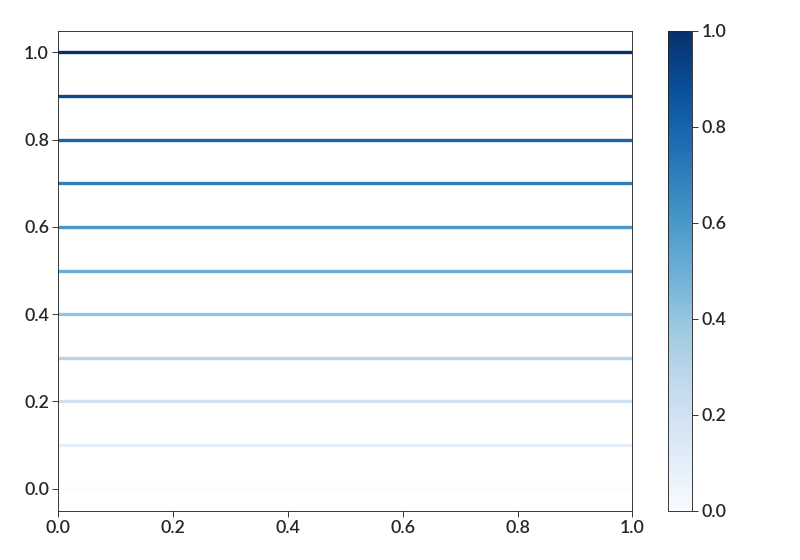
import betterplotlib as bpl
import numpy as np

bpl.set_style()

mappable = bpl.create_mappable(0, 1, "Blues")
fig, ax = bpl.subplots()
for i in np.arange(0, 1.01, 0.1):
    ax.plot([0, 1], [i, i], c=mappable.to_rgba(i))
ax.set_limits(0, 1, -0.05, 1.05)
fig.colorbar(mappable, ax=ax)
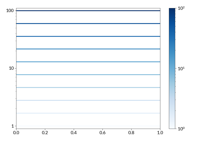
import betterplotlib as bpl
import numpy as np

bpl.set_style()

mappable = bpl.create_mappable(1, 100, "Blues", log=True)
fig, ax = bpl.subplots()
for i in np.logspace(0, 2, 10):
    ax.plot([0, 1], [i, i], c=mappable.to_rgba(i))
ax.log("y")
ax.set_limits(0, 1, 0.9, 110)
fig.colorbar(mappable, ax=ax)
- betterplotlib.fade_color(color)[source]
Create a faded version of a different color
- Parameters:
color – the original color. Can be in any format
- Returns:
the hex color of the faded version
- Return type:
str
import betterplotlib as bpl
import numpy as np
bpl.set_style()

c = "#ac4649"
fig, ax = bpl.subplots()

ax.axhline(2, lw=20, c=c)
ax.axhline(1, lw=20, c=bpl.fade_color(c))
ax.axhline(0, lw=20, c=bpl.unfade_color(bpl.fade_color(c)))

ax.add_text(0.5, 2.1, "Original", va="bottom", ha="center")
ax.add_text(0.5, 1.1, "Faded", va="bottom", ha="center")
ax.add_text(0.5, 0.1, "Faded then Unfaded", va="bottom", ha="center")

ax.set_limits(0, 1, -1, 3)
ax.remove_labels("both")
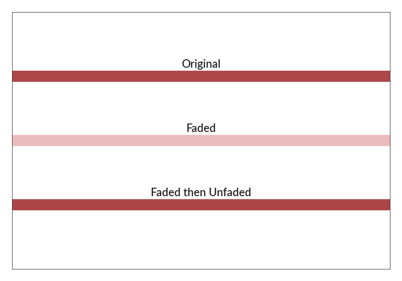
- betterplotlib.unfade_color(color)[source]
Undo the fading applied by fade_color
- Parameters:
color – the faded color. Can be in any format. This color must have a low enough saturation to be unfaded. A ValueError will be raised if this color is too saturated to be unfaded.
- Returns:
the hex color of the unfaded version
- Return type:
str
import betterplotlib as bpl
import numpy as np
bpl.set_style()

c = "#ac4649"
fig, ax = bpl.subplots()

ax.axhline(2, lw=20, c=c)
ax.axhline(1, lw=20, c=bpl.fade_color(c))
ax.axhline(0, lw=20, c=bpl.unfade_color(bpl.fade_color(c)))

ax.add_text(0.5, 2.1, "Original", va="bottom", ha="center")
ax.add_text(0.5, 1.1, "Faded", va="bottom", ha="center")
ax.add_text(0.5, 0.1, "Faded then Unfaded", va="bottom", ha="center")

ax.set_limits(0, 1, -1, 3)
ax.remove_labels("both")

- class betterplotlib.Axes_bpl(*args, **kwargs)[source]
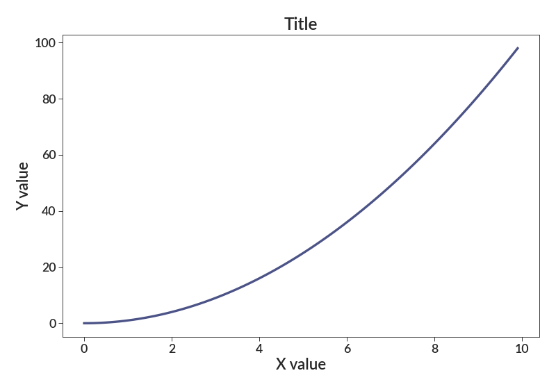
- add_labels(x_label=None, y_label=None, title=None, *args, **kwargs)[source]
Adds labels to the x and y axis, plus a title.
Addition properties will be passed the all single label creations, so any properties will be applied to all. If you want the title to be different, for example, don’t include it here.
- Parameters:
x_label (str) – label for the x axis
y_label (str) – label for the y axis
title (str) – title for the given axis
args – additional properties that will be passed on to all the labels you asked for.
kwargs – additional keyword arguments that will be passed on to all the labels you make.
- Returns:
None
Example:
import betterplotlib as bpl
import numpy as np
bpl.set_style()

xs = np.arange(0, 10, 0.1)
ys = xs**2

fig, ax = bpl.subplots()
ax.plot(xs, ys)
ax.add_labels("X value", "Y value", "Title")
- add_text(x, y, text, coords='data', border_color=None, border_linewidth=3, **kwargs)[source]
Adds text to the specified location. Allows for easy specification of the type of coordinates you are specifying.
Matplotlib allows the text to be in data or axes coordinates, but it’s hard to remember the command for that. This fixes that. The param coords takes care of that.
The x and y locations can be specified in either data or axes coords. If data coords are used, the text is placed at that data point. If axes coords are used, the text is placed relative to the axes. (0,0) is the bottom left, (1,1) is the top right. Remember to use the horizontalalignment and verticalalignment parameters if it isn’t quite in the spot you expect.
Also consider using easy_add_text, which gives 9 possible location to add text with minimal consternation.
- Parameters:
x (int, float) – x location of the text to be added.
y (int, float) – y location of the text to be added.
text (str) – text to be added
coords – type of coordinates. This parameter can be either ‘data’
or ‘axes’. ‘data’ puts the text at that data point. ‘axes’ puts the text in that location relative the axes. See above. :type coords: str :param border_color: An optional color to add a border around the text added.
This is useful for making text more easily visible against a colorful background
- Parameters:
border_linewidth (int) – the width of the border added around the text
kwargs – any additional keyword arguments to pass on the text function. Pass things you would pass to plt.text()
- Returns:
Same as output of plt.text().
Example:
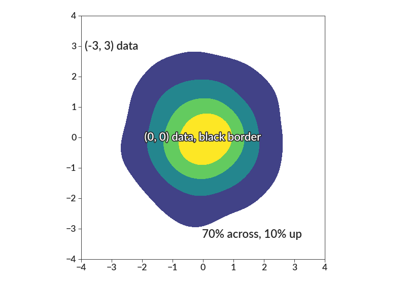
import betterplotlib as bpl
import numpy as np
bpl.set_style()

xs = np.random.normal(0, 1, 1000)
ys = np.random.normal(0, 1, 1000)

bpl.density_contourf(xs, ys, bin_size=0.1, smoothing=0.5)
bpl.set_limits(-4, 4, -4, 4)
bpl.equal_scale()
bpl.add_text(-3, 3, "(-3, 3) data")
bpl.add_text(0.7, 0.1, "70% across, 10% up", "axes")
bpl.add_text(
    0,
    0,
    "(0, 0) data, black border",
    color="white",
    border_color=bpl.almost_black,
    border_linewidth=3,
)
- axhline(y=0, *args, **kwargs)[source]
Place a horizontal line at some point on the axes.
- Parameters:
y (float) – Data value on the y-axis to place the line.
args – Additional parameters that will be passed on the the regular plt.axhline function. See it’s documentation for details.
kwargs – Similarly, additional keyword arguments that will be passed on to the regular plt.axhline function.
import numpy as np
import betterplotlib as bpl
bpl.set_style()

left_xs = np.arange(-20, 1, 0.01)
right_xs = np.arange(1.001, 20, 0.01)
left_ys = left_xs / (left_xs - 1)
right_ys = right_xs / (right_xs - 1)

bpl.make_ax_dark()
bpl.plot(left_xs, left_ys, c=bpl.color_cycle[2])
bpl.plot(right_xs, right_ys, c=bpl.color_cycle[2])
bpl.axvline(1.0, linestyle="--")
bpl.axhline(1.0, linestyle="--")
bpl.set_limits(-10, 10, -10, 10)
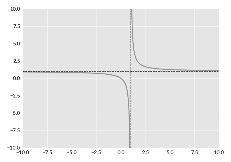
- axvline(x=0, *args, **kwargs)[source]
Place a vertical line at some point on the axes.
- Parameters:
x (float) – Data value on the x-axis to place the line.
args – Additional parameters that will be passed on the the regular plt.axvline function. See it’s documentation for details.
kwargs – Similarly, additional keyword arguments that will be passed on to the regular plt.axvline function.
import numpy as np
import betterplotlib as bpl
bpl.set_style()

left_xs = np.arange(-20, 1, 0.01)
right_xs = np.arange(1.001, 20, 0.01)
left_ys = left_xs / (left_xs - 1)
right_ys = right_xs / (right_xs - 1)

bpl.make_ax_dark()
bpl.plot(left_xs, left_ys, c=bpl.color_cycle[2])
bpl.plot(right_xs, right_ys, c=bpl.color_cycle[2])
bpl.axvline(1.0, linestyle="--")
bpl.axhline(1.0, linestyle="--")
bpl.set_limits(-10, 10, -10, 10)

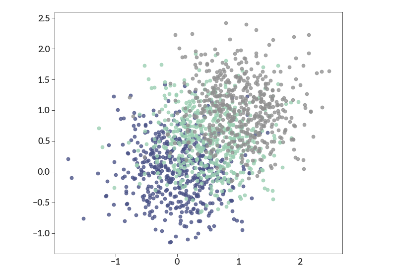
- contour_scatter(xs, ys, bin_size=None, percent_levels=None, smoothing=0, weights=None, labels=False, fill_cmap='white', scatter_kwargs=None, contour_kwargs=None, contourf_kwargs=None)[source]
Create a contour plot with scatter points in the sparse regions.
When a dataset is large, plotting a scatterplot is often really hard to understand, due to many points overlapping and the high density of points overall. A contour or hexbin plot solves many of these problems, but these still have the disadvantage of making outliers less obvious. A simple solution is to plot contours in the dense regions, while plotting individual points where the density is low. That is what this function does.
Here’s how this works under the hood. Skip this paragraph if you don’t care; it won’t affect how you use this. This function uses the numpy 2D histogram function to create an array representing the density in each region. If no binning info is specified by the user, the Freedman-Diaconis algorithm is used in both dimensions to find the ideal bin size for the data. First, an opaque filled contour is plotted, then the contour lines are put on top. Then the outermost contour is made into a matplotlib path object, which lets us check which of the points are outside of this contour. Only the points that are outside are plotted.
- Parameters:
xs (list, ndarray) – list of x values
ys (list, ndarray) – list of y values
bin_size (int, float, list) – Bin size to use for the underlying 2D histogram. This can either be a scalar, in which case the bin size will be the same in both the x dimensions, or else a two element list, where the first element will be the bin size in the x dimension, and the second will be the bin size in the y dimension.
percent_levels (float, list) – A list describing the levels of the contours that will be drawn. Each value in this list contains a float between zero and 1 (inclusive) that describes how much of that data will be enclosed by a contour. So if you pass [0.25, 0.5, 0.75], there will be three contours drawn, that enclose 25%, 50%, and 75% of the data. If this is not passed in, the default is [0.25, 0.5, 0.75, 0.95].
smoothing (int, float, list) – Optional parameter that will allow the contours to be smoothed. Pass in a nonzero value, which will be the standard deviation of the Gaussian kernel use to smooth the histogram. When using this, often choosing smaller bin sizes is advantageous to make a less grainy plot. Has the same format as padding and bin_size, so different smoothing kernels are possible in the x and y directions.
weights (list, np.ndarray) – A list containing weights for each data point. If these are not passed, all data points will be weighted equally.
labels (bool) – Whether or not to label the individual contour lines with their percentage level.
fill_cmap (str, matplotlib.colors.LinearSegmentedColormap) – The colormap used for the filled regions. Can be a strong with any named matplotlib colormap or a colormap object. In addition, there are some special strings that can be used. “white”, which is just a solid white fill, is the default. “background_grey” gives a solid fill that is the same color as the make_ax_dark() background. “modified_greys” is a colormap that starts at the “background_grey” color, then transitions to black.
scatter_kwargs (dict) – Dictionary of additional parameters that will be passed to the underlying matplotlib scatter function used for points in the outer regions.
contour_kwargs (dict) – Dictionary of additional parameters that will be passed to the underlying matplotlib contour function.
contourf_kwargs (dict) – Dictionary of additional parameters that will be passed to the underlying matplotlib contourf function.
Examples
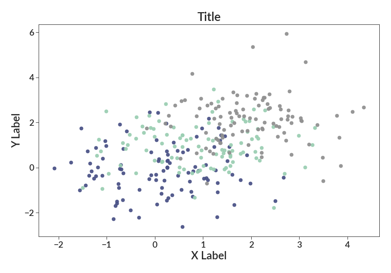
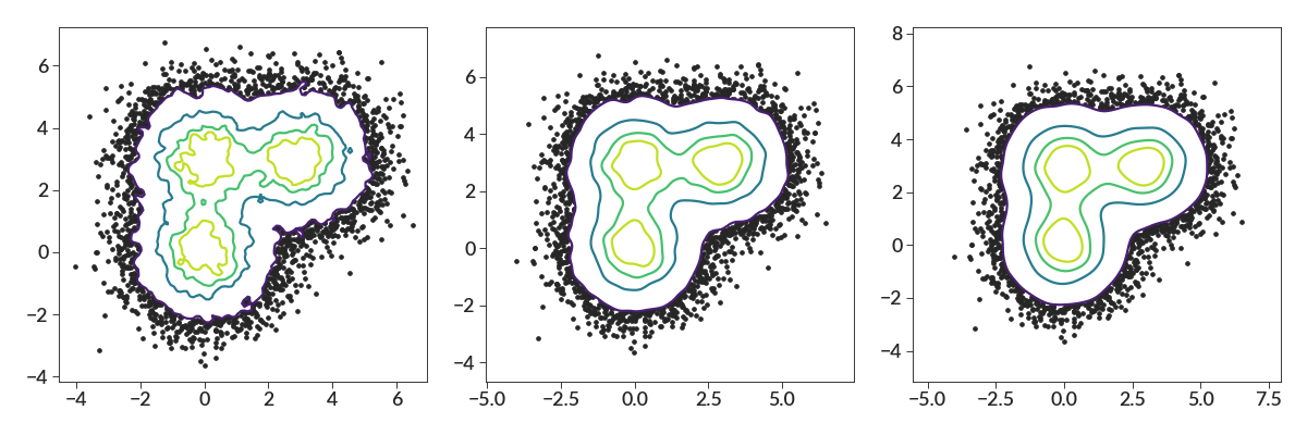
First, we’ll show why this plot is useful. This won’t use any of the fancy settings, other than bin_size, which is used to make the contours look nicer.
import numpy as np
import betterplotlib as bpl

bpl.set_style()

xs = np.concatenate(
    [
        np.random.normal(0, 1, 100000),
        np.random.normal(3, 1, 100000),
        np.random.normal(0, 1, 100000),
    ]
)
ys = np.concatenate(
    [
        np.random.normal(0, 1, 100000),
        np.random.normal(3, 1, 100000),
        np.random.normal(3, 1, 100000),
    ]
)

fig, (ax1, ax2) = bpl.subplots(ncols=2, figsize=[10, 5])

ax1.scatter(xs, ys)
ax2.contour_scatter(xs, ys, bin_size=0.3)
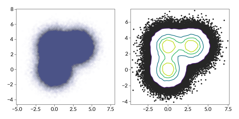
The scatter plot is okay, but the contour makes things easier to see.
We’ll now mess with some of the other parameters. This plot shows how the bin_size parameter changes things.
import numpy as np
import betterplotlib as bpl

bpl.set_style()

xs = np.concatenate(
    [
        np.random.normal(0, 1, 10000),
        np.random.normal(3, 1, 10000),
        np.random.normal(0, 1, 10000),
    ]
)
ys = np.concatenate(
    [
        np.random.normal(0, 1, 10000),
        np.random.normal(3, 1, 10000),
        np.random.normal(3, 1, 10000),
    ]
)

fig, (ax1, ax2, ax3) = bpl.subplots(ncols=3, figsize=[15, 5])

ax1.contour_scatter(xs, ys, bin_size=0.2)
ax2.contour_scatter(xs, ys, bin_size=0.3)
ax3.contour_scatter(xs, ys, bin_size=0.5)
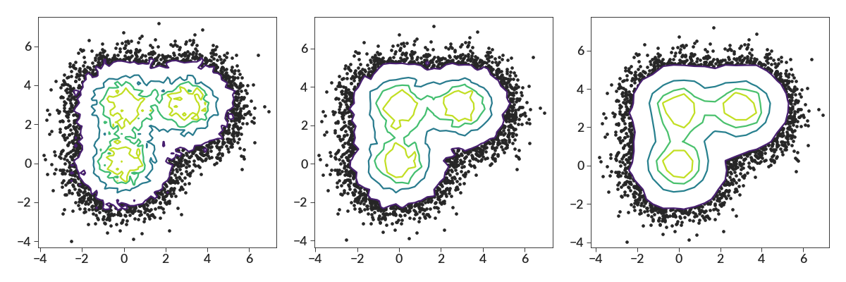
You can see how small values of bin_size lead to more noisy contours. The code will attempt to choose its own value of bin_size if nothing is specified, but it’s normally not a very good choice.
Adjusting the smoothing is often the better way to control the noise.
import numpy as np
import betterplotlib as bpl

bpl.set_style()

xs = np.concatenate(
    [
        np.random.normal(0, 1, 10000),
        np.random.normal(3, 1, 10000),
        np.random.normal(0, 1, 10000),
    ]
)
ys = np.concatenate(
    [
        np.random.normal(0, 1, 10000),
        np.random.normal(3, 1, 10000),
        np.random.normal(3, 1, 10000),
    ]
)

fig, (ax1, ax2, ax3) = bpl.subplots(ncols=3, figsize=[15, 5])

ax1.contour_scatter(xs, ys, bin_size=0.1, smoothing=0.1)
ax2.contour_scatter(xs, ys, bin_size=0.1, smoothing=0.2)
ax3.contour_scatter(xs, ys, bin_size=0.1, smoothing=0.3)
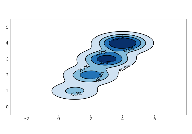
The weights behave exactly the same as they do in the other density contour functions. Here we just have 4 points, but with different weights. We also show the different smoothing for different axes, and the labels.
import betterplotlib as bpl

bpl.set_style()

xs = [1, 2, 3, 4]
ys = [1, 2, 3, 4]
weights = [1, 2, 3, 4]
bpl.contour_scatter(
    xs,
    ys,
    weights=weights,
    bin_size=0.01,
    smoothing=[0.8, 0.3],
    fill_cmap="Blues",
    labels=True,
    contour_kwargs={"colors": "k"},
)
bpl.equal_scale()
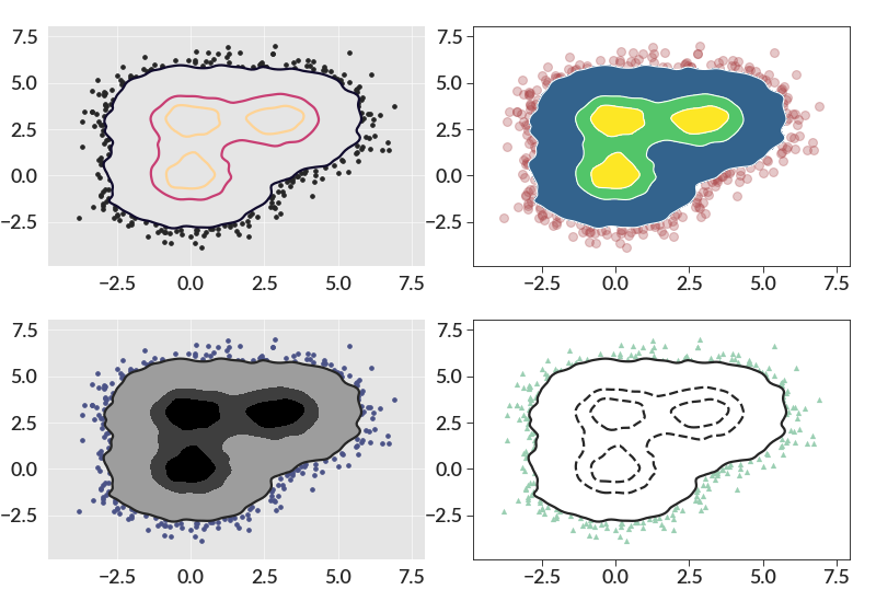
Now we can mess with the fun stuff, which is the fill_cmap param and the kwargs that get passed to the scatter, contour, and contourf function calls. There is a lot of stuff going on here, just for demonstration purposes. Note that the code has some default parameters that it will choose if you don’t specify anything.
import numpy as np
import betterplotlib as bpl

bpl.set_style()

xs = np.concatenate(
    [
        np.random.normal(0, 1, 10000),
        np.random.normal(3, 1, 10000),
        np.random.normal(0, 1, 10000),
    ]
)
ys = np.concatenate(
    [
        np.random.normal(0, 1, 10000),
        np.random.normal(3, 1, 10000),
        np.random.normal(3, 1, 10000),
    ]
)

fig, axs = bpl.subplots(nrows=2, ncols=2)
[ax1, ax2], [ax3, ax4] = axs

percent_levels = [0.99, 0.7, 0.3]
smoothing = 0.2
bin_size = 0.1

ax1.contour_scatter(
    xs,
    ys,
    bin_size=bin_size,
    percent_levels=percent_levels,
    smoothing=smoothing,
    fill_cmap="background_grey",
    contour_kwargs={"cmap": "magma"},
    scatter_kwargs={"s": 10, "c": bpl.almost_black},
)
ax1.make_ax_dark()

# or we can choose our own `fill_cmap`
ax2.contour_scatter(
    xs,
    ys,
    bin_size=bin_size,
    smoothing=smoothing,
    fill_cmap="viridis",
    percent_levels=percent_levels,
    contour_kwargs={"linewidths": 1, "colors": "white"},
    scatter_kwargs={"s": 50, "c": bpl.color_cycle[3], "alpha": 0.3},
)

# There are also my colormaps that work with the dark axes
ax3.contour_scatter(
    xs,
    ys,
    bin_size=bin_size,
    smoothing=smoothing,
    fill_cmap="modified_greys",
    percent_levels=percent_levels,
    scatter_kwargs={"c": bpl.color_cycle[0]},
    contour_kwargs={
        "linewidths": [2, 0, 0, 0, 0, 0, 0],
        "colors": bpl.almost_black,
    },
)
ax3.make_ax_dark()

# the default `fill_cmap` is white.
new_linestyles = ["solid", "dashed", "dashed", "dashed"]
ax4.contour_scatter(
    xs,
    ys,
    bin_size=bin_size,
    smoothing=smoothing,
    percent_levels=percent_levels,
    scatter_kwargs={
        "marker": "^",
        "linewidth": 0.2,
        "c": bpl.color_cycle[1],
        "s": 20,
    },
    contour_kwargs={
        "linestyles": new_linestyles,
        "colors": bpl.almost_black,
    },
)
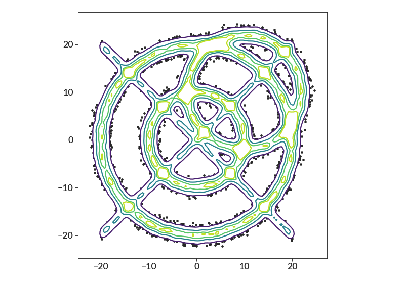
Note that the contours will work appropriately for datasets with “holes”, as demonstrated here.
import numpy as np
import betterplotlib as bpl
bpl.set_style()

rad1 = np.random.normal(10, 0.75, 10000)
theta1 = np.random.uniform(0, 2 * np.pi, 10000)
x1 = [r * np.cos(t) for r, t in zip(rad1, theta1)]
y1 = [r * np.sin(t) for r, t in zip(rad1, theta1)]

rad2 = np.random.normal(20, 0.75, 20000)
theta2 = np.random.uniform(0, 2 * np.pi, 20000)
x2 = [r * np.cos(t) for r, t in zip(rad2, theta2)]
y2 = [r * np.sin(t) for r, t in zip(rad2, theta2)]

rad3 = np.random.normal(12, 0.75, 12000)
theta3 = np.random.uniform(0, 2 * np.pi, 12000)
x3 = [r * np.cos(t) + 10 for r, t in zip(rad3, theta3)]
y3 = [r * np.sin(t) + 10 for r, t in zip(rad3, theta3)]

x4 = np.random.uniform(-20, 20, 3500)
y4 = x4 + np.random.normal(0, 0.5, 3500)

y5 = y4 * (-1)

xs = np.concatenate([x1, x2, x3, x4, x4])
ys = np.concatenate([y1, y2, y3, y4, y5])

fig, ax = bpl.subplots()

ax.contour_scatter(xs, ys, smoothing=0.5, bin_size=0.5)
ax.equal_scale()
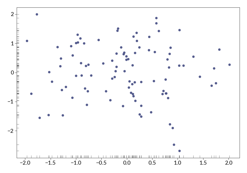
- data_ticks(x_data, y_data, extent=0.015, *args, **kwargs)[source]
Puts tiny ticks on the axis borders making the location of each point.
- Parameters:
x_data (list) – list of values to mark on the x-axis.
y_data (list) – list of values to mark on the y-axis. This doesn’t have to be the same length as x-data, necessarily.
extent (float) – How far the ticks go up from the x-axis. The default is 0.02, meaning the ticks go 2% of the way to the top of the plot. Note that the ticks created by this function will have the same physical size on both axes. Since in general the x and y axes aren’t the same physical size, the ticks on the y-axis will be scaled to match the physical size of the x ticks. This means that in the default case, the y ticks won’t cover 2% of the axis, but again will be the same physical size as the x ticks.
args – Additional arguments to pass to the axvline and axhline functions, which is what is used to make each tick.
kwargs – Additional keyword arguments to pass to the axvline and axhline functions. color is an important one here, and it defaults to almost_black here.
Example
import numpy as np
import betterplotlib as bpl
bpl.set_style()

xs = np.random.normal(0, 1, 100)
ys = np.random.normal(0, 1, 100)

bpl.scatter(xs, ys)
bpl.data_ticks(xs, ys)
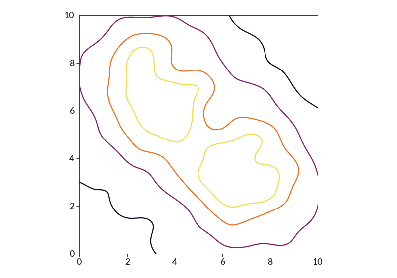
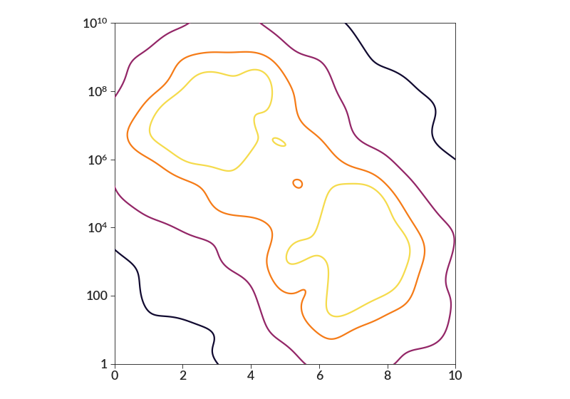
- density_contour(xs, ys, bin_size=None, percent_levels=None, smoothing=0, weights=None, log=False, labels=False, **kwargs)[source]
Creates contours over a 2D histogram of data density.
Here you pass in the location and weights of all data points, then this will calculate the 2D histogram with smartly chosen bin size, and put contours over the top of that histogram.
These contours are just lines, not filled regions. Check out density_contourf() for that.
- Parameters:
xs (list, ndarray) – list of x values
ys (list, ndarray) – list of y values
bin_size (int, float, list) – Bin size to use for the underlying 2D histogram. This can either be a scalar, in which case the bin size will be the same in both the x dimensions, or else a two element list, where the first element will be the bin size in the x dimension, and the second will be the bin size in the y dimension.
percent_levels (float, list) – A list describing the levels of the contours that will be drawn. Each value in this list contains a float between zero and 1 (inclusive) that describes how much of that data will be enclosed by a contour. So if you pass [0.25, 0.5, 0.75], there will be three contours drawn, that enclose 25%, 50%, and 75% of the data. If this is not passed in, the default is [0.25, 0.5, 0.75, 0.95].
smoothing (int, float, list) – Optional parameter that will allow the contours to be smoothed. Pass in a nonzero value, which will be the standard deviation of the Gaussian kernel use to smooth the histogram. When using this, often choosing smaller bin sizes is advantageous to make a less grainy plot. Has the same format as padding and bin_size, so different smoothing kernels are possible in the x and y directions.
weights (list, np.ndarray) – A list containing weights for each data point. If these are not passed, all data points will be weighted equally.
log (bool, list) – Whether or not to do the smoothing and bin creation in log space. This should be used if the plot will be done on log-scaled axes.Can either be a single bool, in which case the x and y scales will both be log (or not), or a two element array, where the first is whether the x axis is log, and the second is y. If this is used, the bin_size and smoothing parameters will be interpreted as dex, rather than raw values.
labels (bool) – Whether or not to label the individual contour lines with their percentage level.
kwargs – Additional keyword arguments to pass on to the original matplotlib contour function.
- Returns:
output of the matplotlib.contour function.
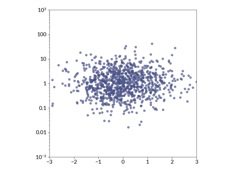
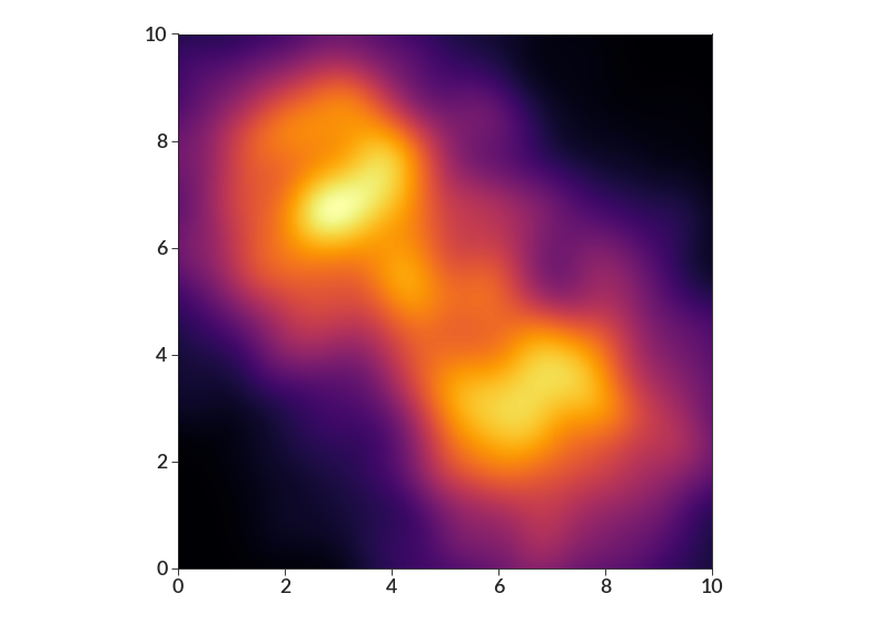
import betterplotlib as bpl
import numpy as np

bpl.set_style()

xs = np.concatenate(
    [
        np.random.normal(3, 2, 1000),
        np.random.normal(7, 2, 1000),
    ]
)
ys = np.concatenate(
    [
        np.random.normal(7, 2, 1000),
        np.random.normal(3, 2, 1000),
    ]
)

bpl.density_contour(xs, ys, bin_size=0.01, smoothing=0.5, cmap="inferno")
bpl.set_limits(0, 10, 0, 10)
bpl.equal_scale()
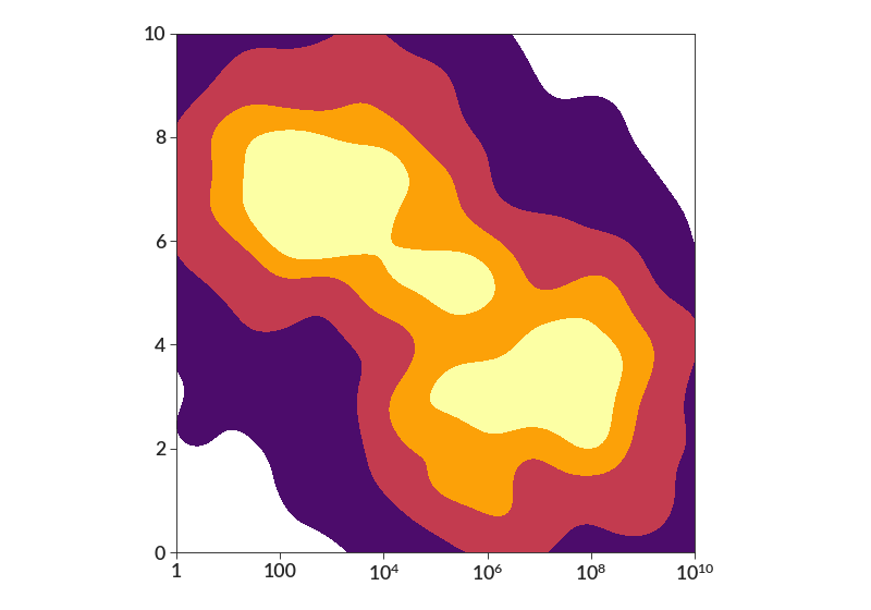
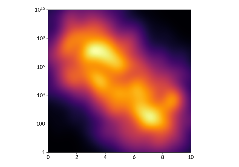
import betterplotlib as bpl
import numpy as np

bpl.set_style()

xs = np.concatenate(
    [
        np.random.normal(3, 2, 1000),
        np.random.normal(7, 2, 1000),
    ]
)
ys = 10 ** np.concatenate(
    [
        np.random.normal(7, 2, 1000),
        np.random.normal(3, 2, 1000),
    ]
)

fig, ax = bpl.subplots()
ax.density_contour(
    xs, ys, bin_size=0.01, smoothing=0.5, log=[False, True], cmap="inferno"
)
ax.log("y")
ax.set_limits(0, 10, 1, 1e10)
bpl.equal_scale()
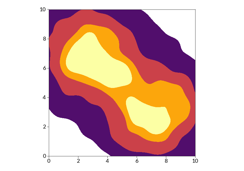
- density_contourf(xs, ys, bin_size=None, percent_levels=None, smoothing=0, weights=None, log=False, **kwargs)[source]
Creates filled contours over a 2D histogram of data density.
Here you pass in the location and weights of all data points, then this will calculate the 2D histogram with smartly chosen bin size, and put contours over the top of that histogram.
These contours are just filled regions with no lines. Check out density_contour() for that.
- Parameters:
xs (list, ndarray) – list of x values
ys (list, ndarray) – list of y values
bin_size (int, float, list) – Bin size to use for the underlying 2D histogram. This can either be a scalar, in which case the bin size will be the same in both the x dimensions, or else a two element list, where the first element will be the bin size in the x dimension, and the second will be the bin size in the y dimension.
percent_levels (float, list) – A list describing the levels of the contours that will be drawn. Each value in this list contains a float between zero and 1 (inclusive) that describes how much of that data will be enclosed by a contour. So if you pass [0.25, 0.5, 0.75], there will be three contours drawn, that enclose 25%, 50%, and 75% of the data. If this is not passed in, the default is [0.25, 0.5, 0.75, 0.95].
smoothing (int, float, list) – Optional parameter that will allow the contours to be smoothed. Pass in a nonzero value, which will be the standard deviation of the Gaussian kernel use to smooth the histogram. When using this, often choosing smaller bin sizes is advantageous to make a less grainy plot. Has the same format as padding and bin_size, so different smoothing kernels are possible in the x and y directions.
weights (list, np.ndarray) – A list containing weights for each data point. If these are not passed, all data points will be weighted equally.
log (bool, list) – Whether or not to do the smoothing and bin creation in log space. This should be used if the plot will be done on log-scaled axes.Can either be a single bool, in which case the x and y scales will both be log (or not), or a two element array, where the first is whether the x axis is log, and the second is y. If this is used, the bin_size and smoothing parameters will be interpreted as dex, rather than raw values.
kwargs – Additional keyword arguments to pass on to the original matplotlib contour function.
- Returns:
output of the matplotlib.contourf function.
import betterplotlib as bpl
import numpy as np

bpl.set_style()

xs = np.concatenate(
    [
        np.random.normal(3, 2, 1000),
        np.random.normal(7, 2, 1000),
    ]
)
ys = np.concatenate(
    [
        np.random.normal(7, 2, 1000),
        np.random.normal(3, 2, 1000),
    ]
)

bpl.density_contourf(xs, ys, bin_size=0.01, smoothing=0.5, cmap="inferno")
bpl.set_limits(0, 10, 0, 10)
bpl.equal_scale()
import betterplotlib as bpl
import numpy as np

bpl.set_style()

xs = 10 ** np.concatenate(
    [
        np.random.normal(3, 2, 1000),
        np.random.normal(7, 2, 1000),
    ]
)
ys = np.concatenate(
    [
        np.random.normal(7, 2, 1000),
        np.random.normal(3, 2, 1000),
    ]
)

fig, ax = bpl.subplots()
ax.density_contourf(
    xs, ys, bin_size=0.01, smoothing=0.5, log=[True, False], cmap="inferno"
)
ax.log("x")
ax.set_limits(1, 1e10, 0, 10)
bpl.equal_scale()
- easy_add_text(text, location, **kwargs)[source]
Adds text in common spots easily.
This was inspired by the plt.legend() function and its loc parameter, which allows for easy placement of legends. This does a similar thing, but just for text.
This can take any additional keyword aguments that can be passed to add_text, other than coords.
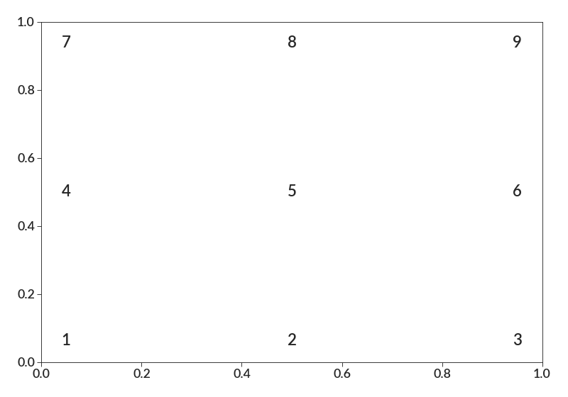
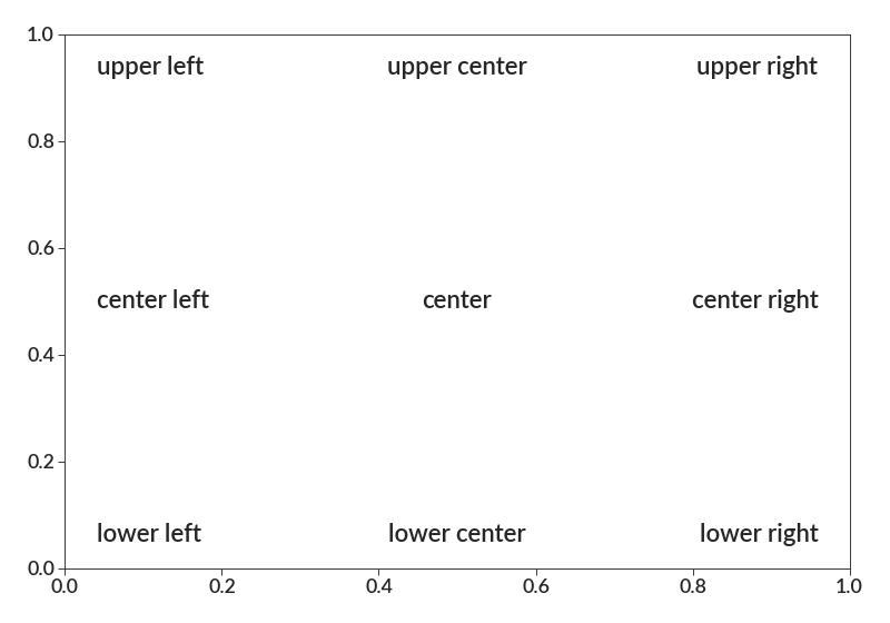
VERY IMPORTANT NOTE: Although this works similar to plt.legend()’s loc parameter, the numbering is NOT the same. My numbering is based on the keypad. 1 is in the bottom left, 5 in the center, and 9 in the top right. You can also specify words that tell the location.
- Parameters:
text (str) – Text to add to the axes.
location (str, int) – Location to add the text. This can be specified two in two possible ways. You can pass an integer, which puts the text at the location corresponding to that number’s location on a standard keyboard numpad. You can also pass a string that describe the location. ‘upper’, ‘center’, and ‘lower’ describe the vertical location, and ‘left’, ‘center’, and ‘right’ describe the horizontal location. You need to specify vertical, then horizontal, like ‘upper right’. Note that ‘center’ is the code for the center, not ‘center center’.
kwargs – additional text parameters that will be passed on to the plt.text() function. Note that this function controls the x and y location, as well as the horizonatl and vertical alignment, so do not pass those parameters.
- Returns:
Same as output of plt.text()
Example:
There are two ways to specify the location, and we will demo both.
import betterplotlib as bpl
bpl.set_style()

bpl.easy_add_text("1", 1)
bpl.easy_add_text("2", 2)
bpl.easy_add_text("3", 3)
bpl.easy_add_text("4", 4)
bpl.easy_add_text("5", 5)
bpl.easy_add_text("6", 6)
bpl.easy_add_text("7", 7)
bpl.easy_add_text("8", 8)
bpl.easy_add_text("9", 9)
import betterplotlib as bpl
bpl.set_style()

bpl.easy_add_text("upper left", "upper left")
bpl.easy_add_text("upper center", "upper center")
bpl.easy_add_text("upper right", "upper right")
bpl.easy_add_text("center left", "center left")
bpl.easy_add_text("center", "center")
bpl.easy_add_text("center right", "center right")
bpl.easy_add_text("lower left", "lower left")
bpl.easy_add_text("lower center", "lower center")
bpl.easy_add_text("lower right", "lower right")
- equal_scale()[source]
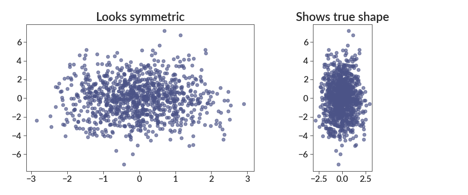
Makes the x and y axes have the same scale.
Useful for plotting things like ra and dec, something with the same quantity on both axes, or anytime the x and y axis have the same scale. It also works when both axes are in log (making one dex the same on both axes) or when only one axis is in log (one dex = one unit in linear space).
It’s really one one command, but it’s one I have a hard time remembering.
Note that this keeps the range the same from the plot as before, so you may want to adjust the limits to make the plot look better. It will keep the axes adjusted the same, though, no matter how you change the limits afterward.
- Returns:
None
Examples:
import betterplotlib as bpl
import numpy as np

bpl.set_style()

# make a Gaussian with more spread in y direction
xs = np.random.normal(0, 1, 1000)
ys = np.random.normal(0, 2, 1000)

fig, [ax1, ax2] = bpl.subplots(figsize=[12, 5], ncols=2)

ax1.scatter(xs, ys)
ax2.scatter(xs, ys)

ax2.equal_scale()

ax1.add_labels(title="Looks symmetric")
ax2.add_labels(title="Shows true shape")
Here is proof that changing the limits don’t change the scaling between the axes.
import betterplotlib as bpl
import numpy as np

bpl.set_style()

# make a Gaussian with more spread in y direction
xs = np.random.normal(0, 1, 1000)
ys = np.random.normal(0, 2, 1000)

fig, [ax1, ax2] = bpl.subplots(figsize=[12, 5], ncols=2)

ax1.scatter(xs, ys)
ax2.scatter(xs, ys)

ax1.equal_scale()
ax2.equal_scale()

ax1.set_limits(-10, 10, -4, 4)
ax2.set_limits(-5, 5, -10, 10)
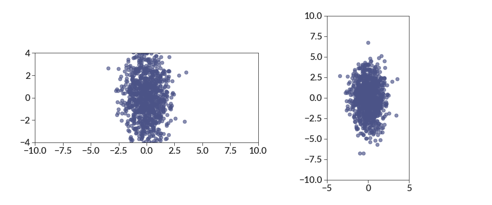
And here’s a demonstration of using this with log scaled axes
import betterplotlib as bpl
import numpy as np

bpl.set_style()

xs = np.random.normal(0, 1, 1000)
ys = 10 ** np.random.normal(0, 0.5, 1000)

fig, ax = bpl.subplots()

ax.scatter(xs, ys)
ax.log("y")
ax.set_limits(-3, 3, 10**-3, 10**3)
ax.equal_scale()
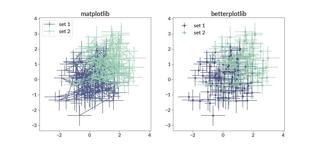
- errorbar(*args, **kwargs)[source]
Wrapper for the plt.errorbar() function.
Style changes: capsize is automatically zero, and the format is automatically a scatter plot, rather than the connected lines that are used by default otherwise. It also adds a black marker edge to distinguish the markers when there are lots of data poitns. Otherwise everything blends together.
- Parameters:
args – Additional arguments to pass to the errorbar function
kwargs – Additional keyword arguments to pass to the errorbar function
import numpy as np
import betterplotlib as bpl
import matplotlib.pyplot as plt
bpl.set_style()

xs = np.random.normal(0, 1, 100)
ys = np.random.normal(0, 1, 100)
yerr = np.random.uniform(0.3, 0.8, 100)
xerr = np.random.uniform(0.3, 0.8, 100)

fig = plt.figure(figsize=[15, 7])
ax1 = fig.add_subplot(121)
ax2 = fig.add_subplot(122, projection="bpl")  # bpl subplot.

for ax in [ax1, ax2]:
    ax.errorbar(xs,   ys,   xerr=xerr, yerr=yerr, label="set 1")
    ax.errorbar(xs+1, ys+1, xerr=xerr, yerr=yerr, label="set 2")
    ax.legend()
ax1.set_title("matplotlib")
ax2.set_title("betterplotlib")
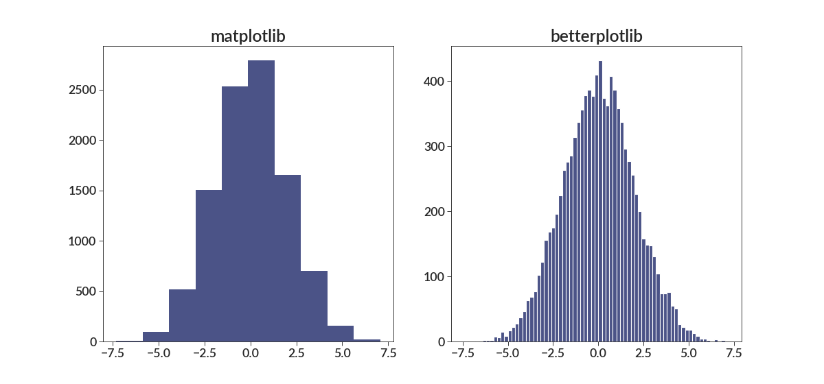
- hist(*args, **kwargs)[source]
A better histogram function. Also supports relative frequency plots, bin size, and hatching better than the default matplotlib implementation.
Everything is the same as the default matplotlib implementation, with the exception a few keyword parameters. rel_freq makes the histogram a relative frequency plot and bin_size controls the width of each bin.
- Parameters:
args – non-keyword arguments that will be passed on to the plt.hist() function. These will typically be the list of values.
rel_freq (bool) – Whether or not to plot the histogram as a relative frequency histogram. Note that this plots the relative frequency of each bin compared to the whole sample. Even if your range excludes some of the data, it will still be included in the relative frequency calculation.
bin_size (float) – The width of the bins in the histogram. The bin boundaries will start at zero, and will be integer multiples of bin_size from there. Specify either this, or bins, but not both.
kwargs – additional controls that will be passed on through to the plt.hist() function.
- Returns:
same output as plt.hist()
Examples:
The basic histogram should look nicer than the default histogram.
import betterplotlib as bpl
import matplotlib.pyplot as plt
import numpy as np

bpl.set_style()

data = np.random.normal(0, 2, 10000)

fig = plt.figure(figsize=[15, 7])
ax1 = fig.add_subplot(121)
ax2 = fig.add_subplot(122, projection="bpl")

ax1.hist(data)
ax2.hist(data)

ax1.set_title("matplotlib")
ax2.add_labels(title="betterplotlib")
There are also plenty of options that make other histograms look nice too.
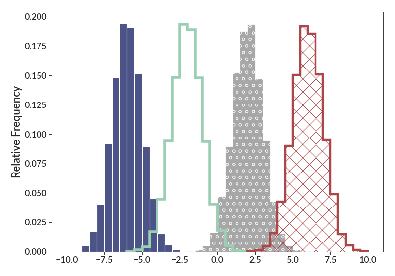
import betterplotlib as bpl
import numpy as np
bpl.set_style()

data1 = np.random.normal(-6, 1, size=10000)
data2 = np.random.normal(-2, 1, size=10000)
data3 = np.random.normal(2, 1, size=10000)
data4 = np.random.normal(6, 1, size=10000)
bin_size = 0.5
bpl.hist(
    data1,
    rel_freq=True,
    bin_size=bin_size,
)
bpl.hist(
    data2,
    rel_freq=True,
    bin_size=bin_size,
    histtype="step",
    linewidth=5,
)
bpl.hist(
    data3,
    rel_freq=True,
    bin_size=bin_size,
    histtype="stepfilled",
    hatch="o",
    alpha=0.8,
)
bpl.hist(
    data4,
    rel_freq=True,
    bin_size=bin_size,
    histtype="step",
    hatch="x",
    linewidth=4,
)

bpl.add_labels(y_label="Relative Frequency")
- kde(xs, smoothing, norm=False, log=False, **kwargs)[source]
Visualize a distribution in 1D with kernel density estimation
- Parameters:
xs (list, ndarray) – The data to visualiza
smoothing (float, list, ndarray) – The smoothing to apply to each data point. If a single value is supplied, that will be applied to all data points. You can also supply a list with length equal to xs to use different smoothing for each data point.
norm (bool) – Whether to normalize the distribution so that integrates to 1.
log (bool) – Whether to do the KDE creation in log space. If this is used, the value for smoothing will be interpreted as dex. If norm is also used, the integration will be done in log space, meaning we integrate dlogx rather than dx.
kwargs – additional keyword arguments to pass to the plot function
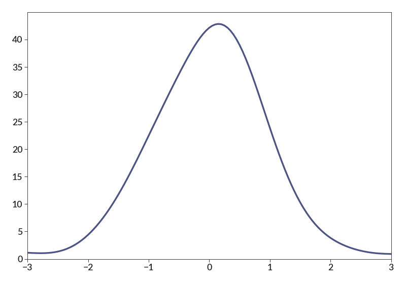
import betterplotlib as bpl
import numpy as np

bpl.set_style()

data = np.random.normal(0, 1, 100)
bpl.kde(data, 0.5)
bpl.set_limits(-3, 3, 0)
You can also use different smoothing for each data point. Note that the area contributed by each point is equal, so points with smaller smoothing give higher points.
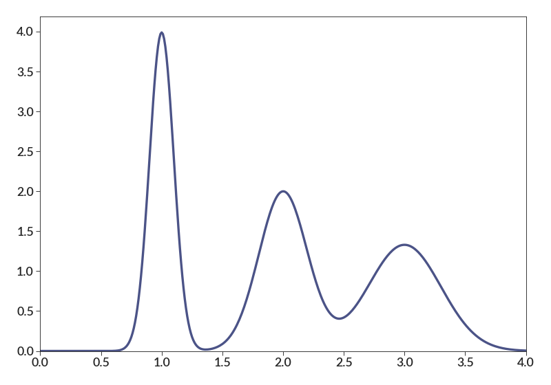
import betterplotlib as bpl

bpl.set_style()

bpl.kde([1, 2, 3], [0.1, 0.2, 0.3])
bpl.set_limits(0, 4, 0)
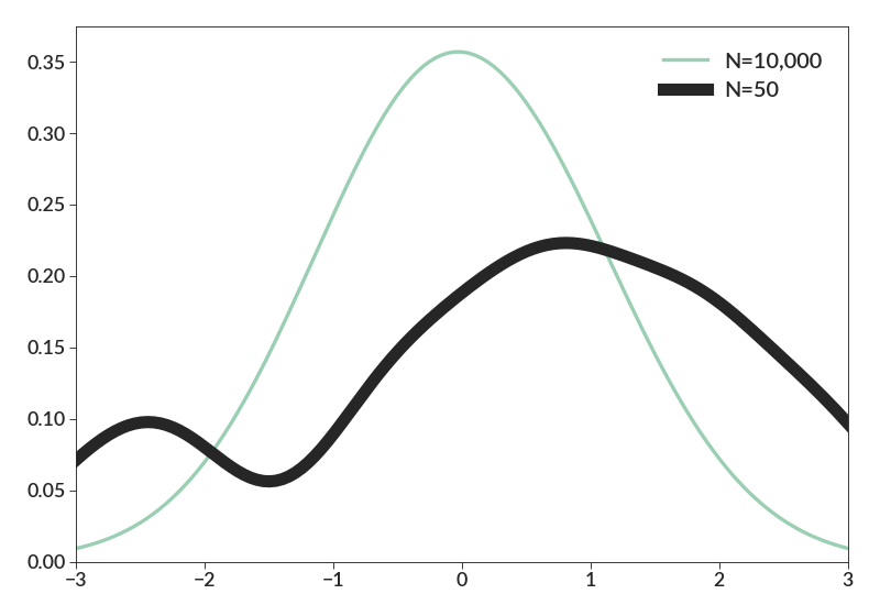
Finally, the normalization parameter allows comparison of datasets of different size. Here I also demonstrate that any additional keyword arguments get passed along to plot.
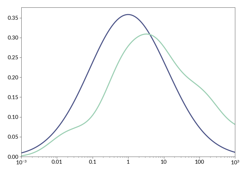
import betterplotlib as bpl
import numpy as np

bpl.set_style()

d1 = np.random.normal(0, 1, 10000)
d2 = np.random.normal(0.5, 1.5, 50)
bpl.kde(d1, 0.5, norm=True, lw=3, c=bpl.color_cycle[1], label="N=10,000")
bpl.kde(d2, 0.5, norm=True, lw=10, c=bpl.almost_black, label="N=50")
bpl.set_limits(-3, 3, 0)
bpl.legend()
When normalization is used with log, the integration will be done in log space as well. Also, when log is used, smoothing will be interpreted in dex.
import betterplotlib as bpl
import numpy as np

bpl.set_style()

d1 = 10**np.random.normal(0, 1, 10000)
d2 = 10**np.random.normal(0.5, 1.5, 50)
bpl.kde(d1, 0.5, norm=True, log=True)
bpl.kde(d2, 0.5, norm=True, log=True)
bpl.log("x")
bpl.set_limits(1e-3, 1e3, 0)
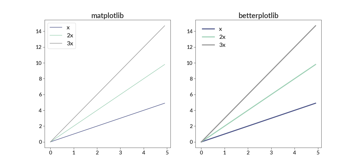
- legend(linewidth=0, *args, **kwargs)[source]
Create a nicer looking legend.
Works by calling the ax.legend() function with the given args and kwargs. If some are not specified, they will be filled with values that make the legend look nice.
- Parameters:
linewidth (float) – linewidth of the border of the legend. Defaults to zero.
args – non-keyword arguments passed on to the ax.legend() fuction.
kwargs – keyword arguments that will be passed on to the ax.legend() function. This will be things like loc, and title, etc.
- Returns:
legend object returned by the ax.legend() function.
The default legend is a transparent background with no border, like so.
import numpy as np
import betterplotlib as bpl
import matplotlib.pyplot as plt
bpl.set_style()

x = np.arange(0, 5, 0.1)

fig = plt.figure(figsize=[15, 7])
ax1 = fig.add_subplot(121)
ax2 = fig.add_subplot(122, projection="bpl")  # bpl subplot.

for ax in [ax1, ax2]:
    ax.plot(x, x, label="x")
    ax.plot(x, 2*x, label="2x")
    ax.plot(x, 3*x, label="3x")
    ax.legend(loc=2)

ax1.set_title("matplotlib")
ax2.set_title("betterplotlib")
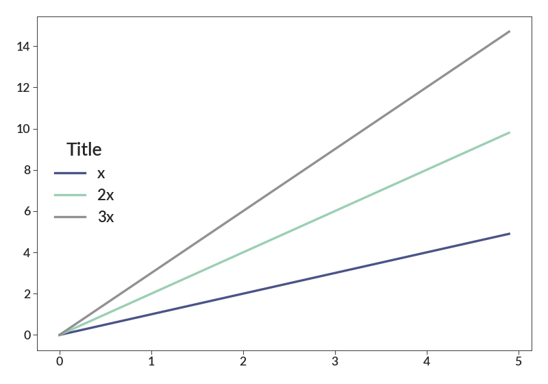
You can still pass in any kwargs to the legend function you want.
import betterplotlib as bpl
import numpy as np

bpl.set_style()

x = np.arange(0, 5, 0.1)

bpl.plot(x, x, label="x")
bpl.plot(x, 2*x, label="2x")
bpl.plot(x, 3*x, label="3x")
bpl.legend(fontsize=20, loc=6, title="Title")
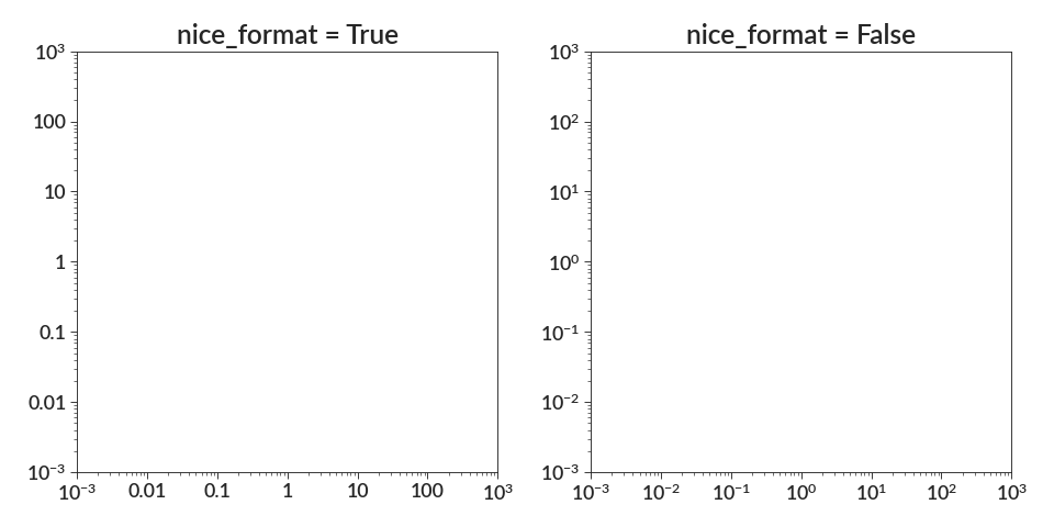
- log(axes, nice_format=True)[source]
Set the x and/or y axis to be log-scaled
- Parameters:
axes – which axes to log scale. Pass “x” for the x axis, “y” for the y axis, or “both”.
nice_format (bool) – whether to format numbers near 1 as regular numbers, instead of exponential notation. For example, passing True will show 1 as 1, while False will show 1 as 10^0. Defaults to True.
- Returns:
None
import betterplotlib as bpl

bpl.set_style()

fig, axs = bpl.subplots(ncols=2, figsize=[12, 6])

for ax, nice_format in zip(axs, [True, False]):
    ax.log("both", nice_format)
    ax.set_limits(1e-3, 1e3, 1e-3, 1e3)
    ax.equal_scale()
    ax.add_labels(title=f"nice_format = {str(nice_format)}")
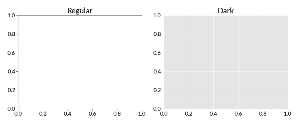
- make_ax_dark(grid=True, minor_ticks=False)[source]
Turns an axis into one with a dark background with white gridlines.
This will turn an axis into one with a slightly light gray background, and with solid white gridlines. All the axes spines are removed (so there isn’t any outline), and the ticks are removed too.
- Parameters:
grid (bool) – Whether or not to draw the grid. Defaults to True.
minor_ticks (bool) – Whether or not to add minor ticks. They will be drawn as dotted lines, rather than solid lines in the axes space. If grid is False then this parameter does not matter.
- Returns:
None
import betterplotlib as bpl
bpl.set_style()

fig, (ax0, ax1) = bpl.subplots(figsize=[12, 5], ncols=2)
ax1.make_ax_dark()
ax0.set_title("Regular")
ax1.set_title("Dark")
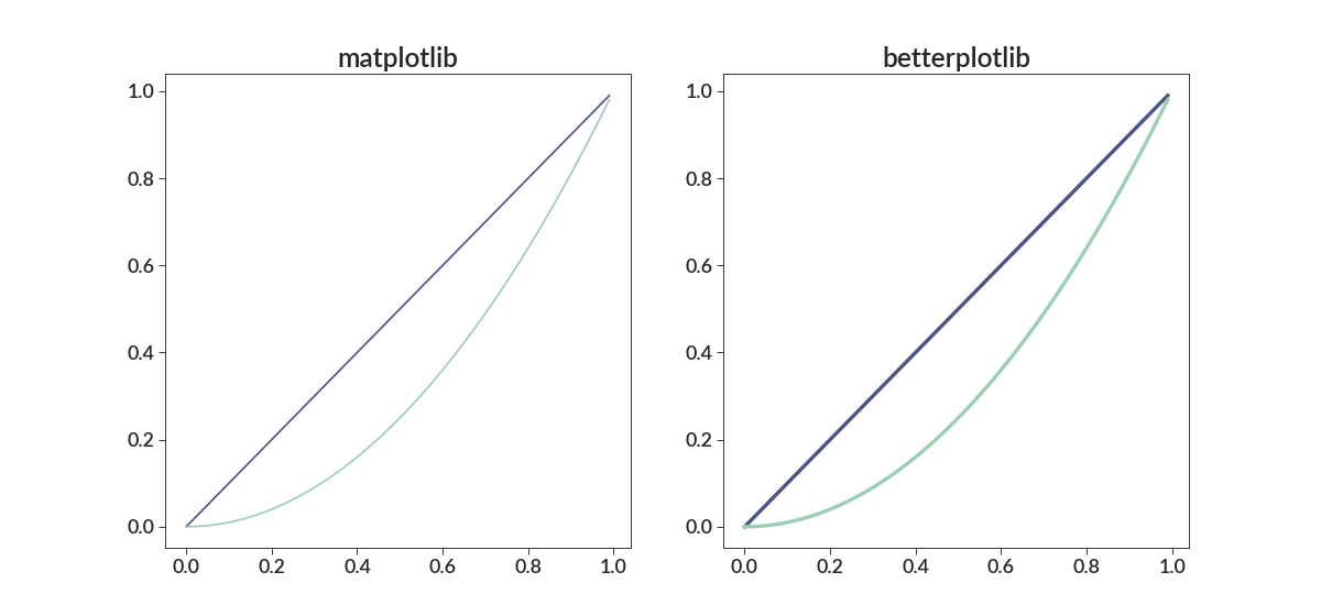
- plot(*args, **kwargs)[source]
A slightly improved plot function.
This is best used for plotting lines, while the scatter() function is best used for plotting points.
Currently all this does is make the lines thicker, which looks better. There isn’t any added functionality.
The parameters here are the exact same as they are for the regular plt.plot() or ax.plot() functions.
- Parameters:
args – Additional arguments to pass to the plot function
kwargs – Additional keyword arguments to pass to the plot function
import numpy as np
import betterplotlib as bpl
import matplotlib.pyplot as plt
bpl.set_style()

xs = np.arange(0, 1, 0.01)
ys_1 = xs
ys_2 = xs**2

fig = plt.figure(figsize=[15, 7])
ax1 = fig.add_subplot(121)
ax2 = fig.add_subplot(122, projection="bpl")  # bpl subplot.

ax1.plot(xs, ys_1)
ax1.plot(xs, ys_2)

ax2.plot(xs, ys_1)
ax2.plot(xs, ys_2)

ax1.set_title("matplotlib")
ax2.set_title("betterplotlib")
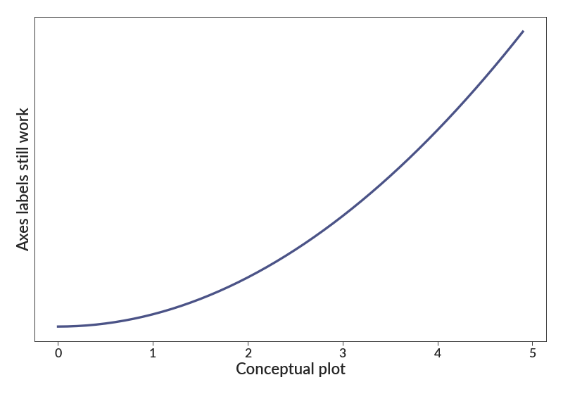
- remove_labels(labels_to_remove)[source]
Removes the labels and tick marks from an axis border.
This is useful for making conceptual plots where the numbers on the axis don’t matter. Axes labels still work, also.
Note that this can break when used with the various remove_*() functions. Order matters with these calls, presumably due to something with the way matplotlib works under the hood. Mess around with it if you’re having trouble.
- Parameters:
labels_to_remove (str) – location of labels to remove. Choose from: “both”, “x”, or “y”.
- Returns:
None
Example:
import betterplotlib as bpl
import numpy as np
bpl.set_style()

xs = np.arange(0, 5, 0.1)
ys = xs**2

fig, ax = bpl.subplots()

ax.plot(xs, ys)

ax.remove_labels("y")
ax.remove_ticks("top")
ax.add_labels("Conceptual plot", "Axes labels still work")
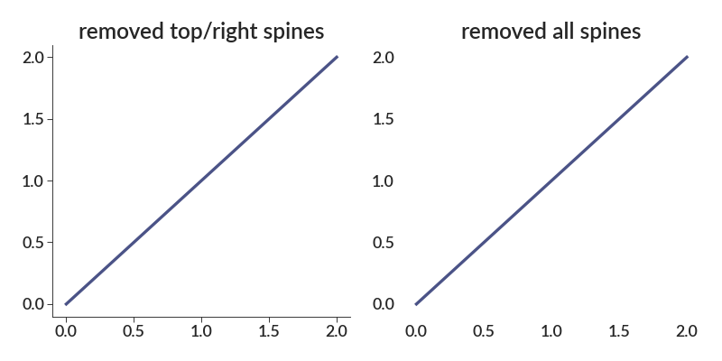
- remove_spines(*spines_to_remove)[source]
Remove spines from the axis.
Spines are the lines on the side of the axes. In many situations, these are not needed, and are just junk. Calling this function will remove the specified spines from an axes object. Note that it does not remove the tick labels if they are visible for that axis.
Note that this function can mess up if you call this function multiple times with the same axes object, due to the way matplotlib works under the hood. I haven’t really tested it extensively (since I have never wanted to call it more than once), but I think the last function call is the one that counts. Calling this multiple times on the same axes would be pointless, though, since you can specify multiple axes in one call. If you really need to call it multiple times and it is breaking, let me know and I can try to fix it. This also can break when used with the various remove_*() functions. Order matters with these calls, for some reason.
- Parameters:
spines_to_remove – The desired spines to remove. Can choose from “all”, “top”, “bottom”, “left”, or “right”.
- Returns:
None
import betterplotlib as bpl
bpl.set_style()

fig, (ax0, ax1) = bpl.subplots(ncols=2, figsize=[10, 5])

ax0.plot([0, 1, 2], [0, 1, 2])
ax1.plot([0, 1, 2], [0, 1, 2])

ax0.remove_spines("top", "right")
ax1.remove_spines("all")

ax0.set_title("removed top/right spines")
ax1.set_title("removed all spines")
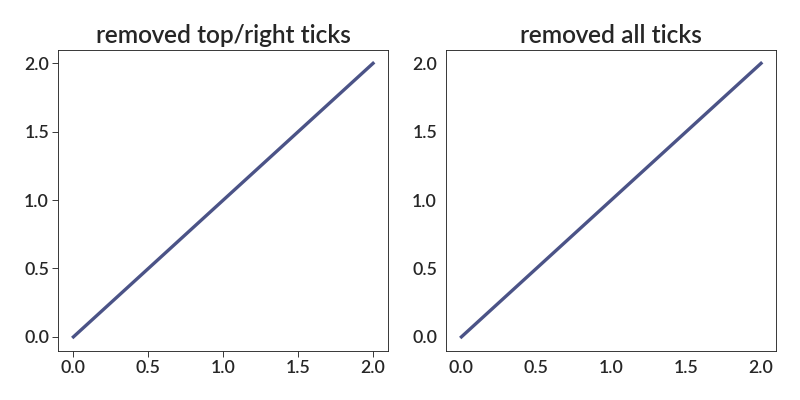
- remove_ticks(*ticks_to_remove)[source]
Removes ticks from the given locations.
In some situations, ticks aren’t needed or wanted. Note that this doesn’t remove the spine itself, or the labels on that axis.
Note that this can break when used with the various remove_*() functions. Order matters with these calls, presumably due to something with the way matplotlib works under the hood. Mess around with it if you’re having trouble.
- Parameters:
ticks_to_remove – locations where ticks need to be removed from. Choose from: “all, “top”, “bottom”, “left”, or “right”, and pass in as many as you’d like
- Returns:
None
import betterplotlib as bpl
bpl.set_style()

fig, (ax0, ax1) = bpl.subplots(ncols=2, figsize=[10, 5])

ax0.plot([0, 1, 2], [0, 1, 2])
ax1.plot([0, 1, 2], [0, 1, 2])

ax0.remove_ticks("top", "right")
ax1.remove_ticks("all")

ax0.set_title("removed top/right ticks")
ax1.set_title("removed all ticks")
- scatter(*args, **kwargs)[source]
Makes a scatter plot that looks nicer than the matplotlib default.
The call works just like a call to plt.scatter. It will set a few default parameters, but anything you pass in will override the default parameters. This function also uses the color cycle, unlike the default scatter.
It also automatically determines a guess at the proper alpha (transparency) of the points in the plot.
NOTE: the c parameter tells just the facecolor of the points, while color specifies the whole color of the point, including the edge line color. This follows the default matplotlib scatter implementation.
- Parameters:
args – non-keyword arguments that will be passed on to the plt.scatter function. These will typically be the x and y lists.
kwargs – keyword arguments that will be passed on to plt.scatter.
- Returns:
the output of the plt.scatter call is returned directly.
import betterplotlib as bpl
import numpy as np
bpl.set_style()

x = np.random.normal(0, scale=0.5, size=500)
y = np.random.normal(0, scale=0.5, size=500)

for dx in [0, 0.5, 1]:
    bpl.scatter(x + dx, y + dx)
bpl.equal_scale()
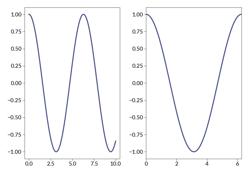
- set_limits(x_min=None, x_max=None, y_min=None, y_max=None, **kwargs)[source]
Set axes limits for both x and y axis at once.
Any additional kwargs will be passed on to the matplotlib functions that set the limits, so refer to that documentation to find the allowed parameters.
- Parameters:
x_min (int, float) – minimum x value to be plotted
x_max (int, float) – maximum x value to be plotted
y_min (int, float) – minimum y value to be plotted
y_max (int, float) – maximum y value to be plotted
kwargs – Kwargs for the set_limits() functions.
- Returns:
none.
Example:
import betterplotlib as bpl
import numpy as np
bpl.set_style()

xs = np.arange(0, 10, 0.01)
ys = np.cos(xs)

fig, [ax1, ax2] = bpl.subplots(ncols=2)

ax1.plot(xs, ys)

ax2.plot(xs, ys)
ax2.set_limits(0, 2*np.pi, -1.1, 1.1)
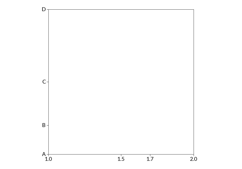
- set_ticks(axis, ticks, labels=None, minor=False)[source]
Set tick marks on an axis, with optional label names
This is just a wrapper around ax.xaxis.set_ticks(), but I always forget that syntax.
- Parameters:
axis (str) – to put these ticks on either the “x” or “y” axis
ticks (list) – The list of locations to put ticks
labels (list) – The labels to put for each of the ticks passed in
minor (bool) – Whether these ticks should be major or minor ticks
import betterplotlib as bpl

bpl.set_style()

bpl.set_limits(1, 2, 1, 2)
bpl.equal_scale()
bpl.set_ticks("x", [1, 1.5, 1.7, 2.0])
bpl.set_ticks("y", [1, 1.2, 1.5, 2.0], ["A", "B", "C", "D"])
import betterplotlib as bpl

bpl.set_style()

bpl.log("both")
bpl.set_limits(1, 10, 1, 10)
bpl.equal_scale()
bpl.set_ticks("x", [1, 10], ["A", "D"])
bpl.set_ticks("x", [3, 5], ["b", "c"], minor=True)
bpl.set_ticks("y", [1, 10])
bpl.set_ticks(
    "y",
    [1, 2, 3, 4, 5, 6, 7, 8, 9],
    ["", "2", "3", "", "5", "", "7", "", ""],
    minor=True,
)
- shaded_density(xs, ys, bin_size=None, smoothing=0, cmap='Greys', weights=None, log_xy=False, log_hist=False)[source]
Creates shaded regions showing the density.
Is essentially a 2D histogram, but supports smoothing. Under the hood, this uses the pcolormesh function in matplotlib.
- Parameters:
xs (list, ndarray) – list of x values
ys (list, ndarray) – list of y values
bin_size (int, float, list) – Bin size to use for the underlying 2D histogram. This can either be a scalar, in which case the bin size will be the same in both the x dimensions, or else a two element list, where the first element will be the bin size in the x dimension, and the second will be the bin size in the y dimension.
smoothing (int, float, list) – Optional parameter that will smooth the shaded density. Pass in a nonzero value, which will be the standard deviation of the Gaussian kernel use to smooth the histogram. When using this, often choosing smaller bin sizes is advantageous to make a less grainy plot. Has the same format as padding and bin_size, so different smoothing kernels are possible in the x and y directions.
cmap (str) – The colormap to use for the shading
weights (list, np.ndarray) – A list containing weights for each data point. If these are not passed, all data points will be weighted equally.
log_xy – Whether or not to do the smoothing and bin creation in log space. This should be used if the plot will be done on log-scaled axes.Can either be a single bool, in which case the x and y scales will both be log (or not), or a two element array, where the first is whether the x axis is log, and the second is y. If this is used, the bin_size and smoothing parameters will be interpreted as dex, rather than raw values.
log_hist (bool) – Whether or not to use the log of the histogram values to compute the shading, or just the values of the histogram.
- Returns:
output of the pcolormesh function call.
import betterplotlib as bpl
import numpy as np
bpl.set_style()

xs = np.concatenate(
    [np.random.normal(3, 2, 1000), np.random.normal(7, 2, 1000)]
)
ys = np.concatenate(
    [np.random.normal(7, 2, 1000), np.random.normal(3, 2, 1000)]
)

bpl.shaded_density(xs, ys, bin_size=0.01, smoothing=0.5, cmap="inferno")
bpl.set_limits(0, 10, 0, 10)
bpl.equal_scale()
import betterplotlib as bpl
import numpy as np

bpl.set_style()

xs = np.concatenate(
    [np.random.normal(3, 2, 1000), np.random.normal(7, 2, 1000)]
)
ys = 10 ** np.concatenate(
    [np.random.normal(7, 2, 1000), np.random.normal(3, 2, 1000)]
)

fig, ax = bpl.subplots()
bpl.shaded_density(
    xs,
    ys,
    bin_size=0.01,
    smoothing=0.5,
    cmap="inferno",
    log_xy=[False, True],
)
ax.log("y")
bpl.set_limits(0, 10, 1, 1e10)
bpl.equal_scale()
- twin_axis(axis, new_ticks, label, old_to_new_func=None, new_to_old_func=None)[source]
Create a twin axis, where the new axis values are an arbitrary function of the old values.
This is used when you want to put two related quantities on the axis, for example distance/redshift in astronomy, where one isn’t a simple scaling of the other. If you want a simple linear or log scale, use the twin_axis_simple function. This one will create a new axis that is an arbitrary scale.
- Parameters:
axis (str) – Whether the new axis labels will be on the “x” or “y” axis. If “x” is chosen this will place the markers on the top botder of the plot, while “y” will place the values on the left border of the plot. “x” and “y” are the only allowed values.
new_ticks (list, np.ndarray) – List of of locations (in the new data values) to place ticks. Any values outside the range of the plot will be ignored.
label (str) – The label given to the newly created axis.
old_to_new_func – Function that takes values on the original axis and transforms them to corresponding values on the soon-to-be created axis. Either this parameter or new_to_old_func can be used, but not both.
new_to_old_func – Function that takes values on the soon-to-be-created axis and transforms them to corresponding values on the original axis. Either this parameter or old_to_new_func can be used, but not both.
- Returns:
New axis object that was created, containing the newly created labels.
import betterplotlib as bpl
bpl.set_style()

def square(x):
    return x**2

def cubed(x):
    return x**3

fig, ax = bpl.subplots(figsize=[5, 5], tight_layout=True)
ax.set_limits(0, 10, 0, 10.0001)  # to avoid floating point errors
ax.add_labels("x", "y")
ax.twin_axis("y", [0, 10, 30, 60, 100], "$y^2$", square)
ax.twin_axis("x", [0, 10, 100, 400, 1000], "$x^3$", cubed)
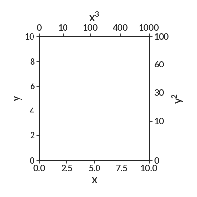
Note that we had to be careful with floating point errors when one of the markers we want is exactly on the edge. Make the borders slightly larger to ensure that all labels fit on the plot.
There are two ways to give the funtion that transforms the values from one axis to the other. The parameter old_to_new_func (used as the last parameter in the plot above) takes values on the original axis and transforms them to values on the newly created axis. However, the parameter new_to_old_func does the inverse, taking values on the new axis and transforming them to the currently existing one. Only one of these two parameters can be provided. Identical plots can be created with either function, but due to specifics of the implementation, using the new_to_old_func parameter is slightly more computationally efficient. Here’s an example of an identical plot to the first created with new_to_old_func instead.
import betterplotlib as bpl

bpl.set_style()

def cube_root(x):
    return x ** (1.0 / 3.0)

fig, ax = bpl.subplots(figsize=[5, 5], tight_layout=True)
ax.set_limits(0, 10, 0, 10.0001)  # to avoid floating point errors
ax.add_labels("x", "y")
ax.twin_axis("y", [0, 10, 30, 60, 100], "$y^2$", new_to_old_func=np.sqrt)
ax.twin_axis(
    "x", [0, 10, 100, 400, 1000], "$x^3$", new_to_old_func=cube_root
)

This function will ignore values for the ticks that are outside the limits of the plot. The following plot isn’t the most useful, since it could be done with the axis_twin_simple, but it gets the idea across.
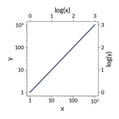
import betterplotlib as bpl
bpl.set_style()

xs = np.logspace(0, 3, 100)

fig, ax = bpl.subplots(figsize=[5, 5], tight_layout=True)
ax.plot(xs, xs)
ax.log("both")
ax.add_labels("x", "y")
# extraneous values are ignored.
ax.twin_axis("x", [-1, 0, 1, 2, 3, 4, 5], "log(x)", np.log10)
ax.twin_axis("y", [-1, 0, 1, 2, 3, 4, 5], "log(y)", np.log10)
- twin_axis_simple(axis, lower_lim, upper_lim, label='', log=False)[source]
Creates a differently scaled axis on either the top or the left.
Note that this only does simple scalings of the new axes, which will still only be linear or log scaled axes. If you want a function that smartly places labels based on a function that takes one set of axes values to another (in a potentially nonlinear way), the other function I haven’t made will do that.
- Parameters:
axis (str) – Where the new scaled axis will be placed. Must either be “x” or “y”.
lower_lim (float) – Value to be put on the left/bottom of the newly created axis.
upper_lim (float) – Value to be put on the right/top of the newly created axis.
label (str) – The label to put on this new axis.
log (bool) – Whether or not to log scale this axis.
- Returns:
the new axes
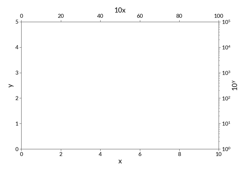
import betterplotlib as bpl
bpl.set_style()

bpl.set_limits(0, 10, 0, 5)
bpl.add_labels("x", "y")
bpl.twin_axis_simple("x", 0, 100, "$10 x$")
bpl.twin_axis_simple("y", 1, 10**5, "$10^y$", log=True)
Note that for a slightly more complicated version of this plot, say if we wanted the top x axis to be x^2 rather than 10x, the limits would still be the same, but since the new axis will always be a linear or log scale the new axis won’t represent the true relationship between the variables on the twin axes. See twin_axis for that.