Style and Colors
Betterplotlib has multiple style options that make plots look better in general. These are all accessed through bpl.set_style(). The default style is the best choice for everyday usage. bpl.set_style(“white”), makes lines white, so they are visible against a dark background in a presentation, and bpl.set_style(“latex)” uses LateX for font rendering.
The general best practice is to call the style once at the beginning of the file or notebook, right after the imports.
See the full documentation linked below for some examples.
|
Set style settings that will apply to all plots after this function call. |
Colors
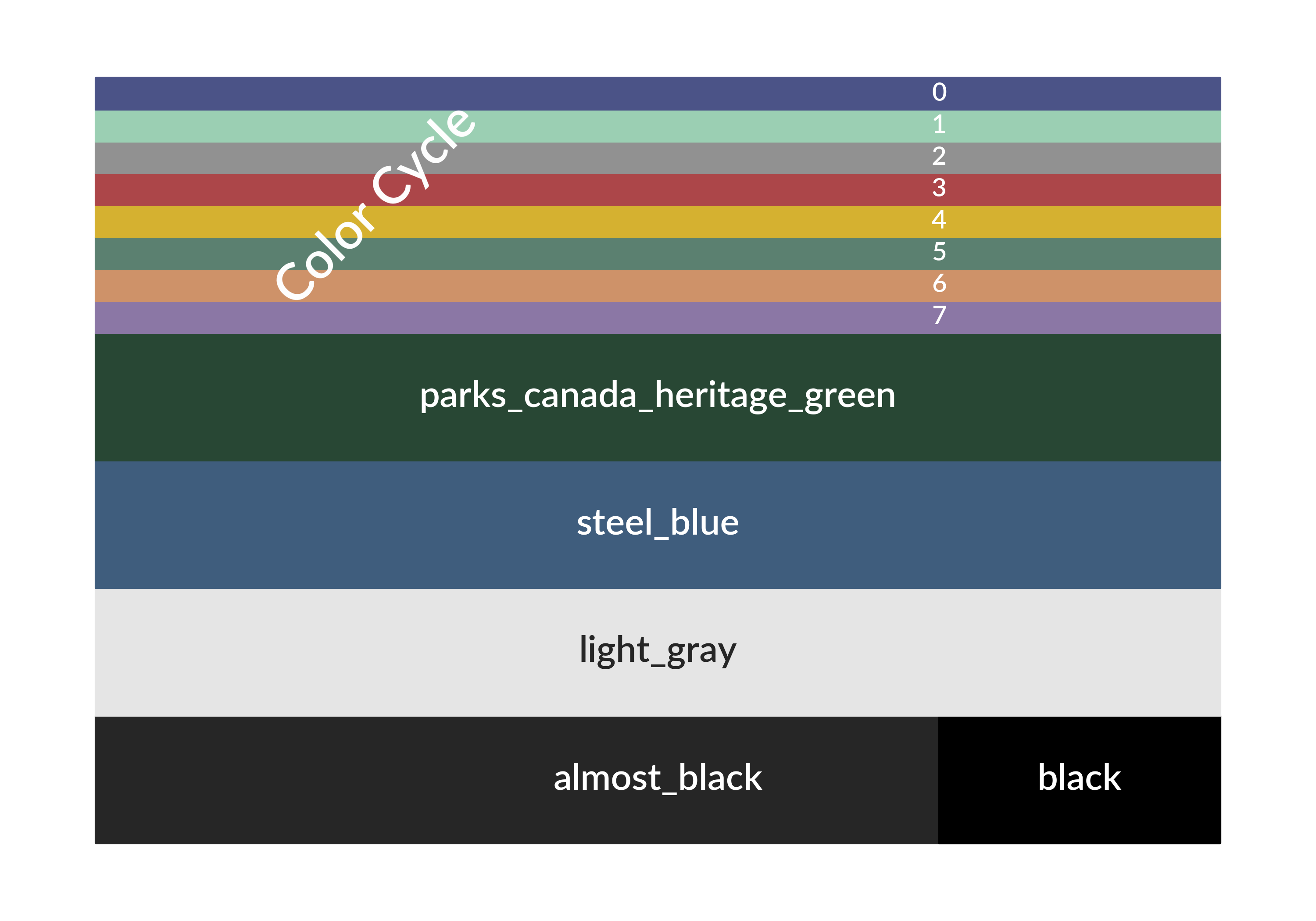
Betterplotlib has some additional colors that have been defined. In particular, the color cycle is set to a custom set. Some other colors are ones I have found and liked. parks_canada_heritage_green is the color of the road signs in the Candaian National Parks, which I really liked. steel_blue is a nice dark blue color. light_gray is what it sounds like, and it used for the dark axes. almost_black is just what it sounds like, and is used as the default black throughout the plots to make them slightly easier on the eyes. Here are all those defined colors.